
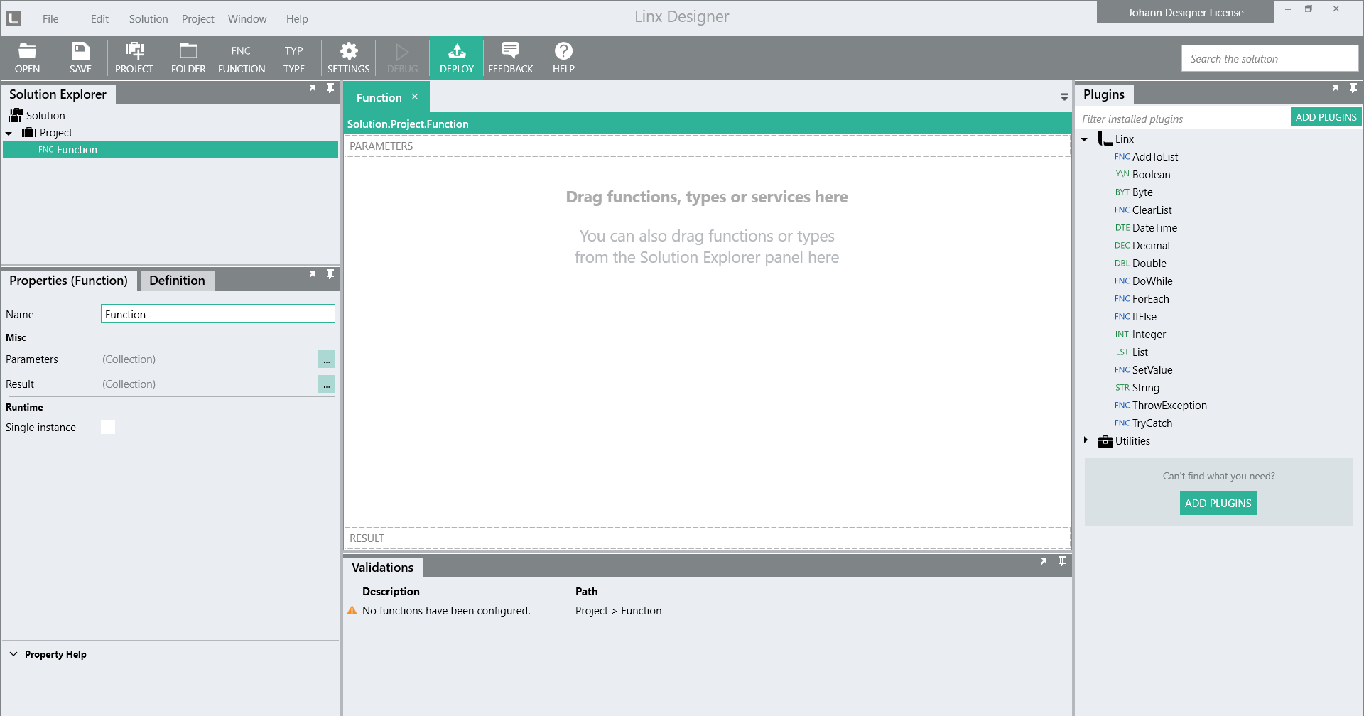
Linx Designer User Interface
The Linx Designer panel layout can be customised by moving them around at will.
Each panel contains the following features, accessed by clicking on the respective icons that are positioned in the top-right corner of the panel:
Float Window – To open the panel in its own window which could be maximized for ease of use.
Dock Window – To dock an open or floating panel window to its original position.
Auto Hide – To “auto hide” a panel so that only a tab name will display. Click on the tab name to have the panel contents displayed. Click on the Auto Hide icon to revert back to the default panel display.
Hide – To hide or “close” a panel. (To have the panel displayed again in its default position, go to Windows on the top menu bar and select the checkbox of the relevant panel.)
Solution Explorer
The Solution Explorer panel displays the Projects, Functions, Services, CTypes and Folders that are included in your Solution.
The details of each component listed in the Solution Explorer are maintained in the design canvas (center of interface) and in the Properties section. Click on the relevant component to access its properties and to view on the design canvas the Functions or Types that have been added to the component's logic flow.
Plugins
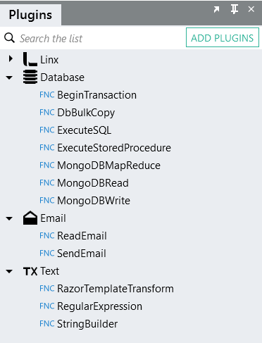
The plugins that have been added to a Solution are listed in the Plugins panel.
Drag-and-drop the required plugin element (Function or Type) onto the design canvas, or in the case of a Service, onto the Solution Explorer panel.
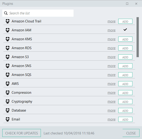
Add a Plugin
Click the Add Plugins button, then click the Add button of the relevant plugin (see below).
Maintain Plugins
Each Plugin will have relevant options available to:
- get more information on the plugin
- remove the plugin
- upgrade the plugin
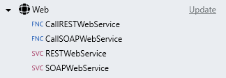
These options are displayed next to each plugin name, as shown below:

Note:
The upgrade option will only display when an upgrade is available for the plugin.
To access the options for removing a plugin or for getting more information, hover over the plugin name to display the option icons.
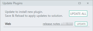
Update
Click the Update link.
Then click the UPDATE ALL button or the specific plugin's UPDATE button.
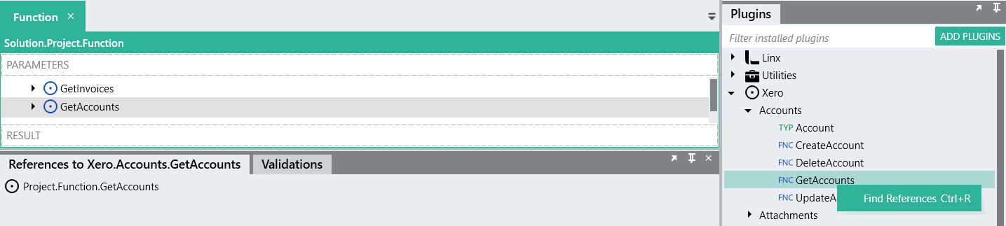
Find plugin references
You can locate where a function, type or service, e.g. the CommandLine function, is being used in your solution by making use of the "Find References" functionality. Right-click on the relevant function, type or service, then click on Find References.
When executing this command, you will get a list of all the places in the solution where this function, type or service is being used. You can navigate to an usage instance by double-clicking on the search result.
 Plugins Tutorial Video
Design canvas
The design canvas, in the center of the interface, is where all the Functions and Types that form part of a Solution are placed. Once a component is placed on the canvas its properties can be set to determine the way in which it will function.
Properties
The details displayed in the Properties section are dependent on the associated component.
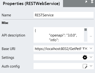
A typical layout would include:
- Heading, indicating the name of the Plugin in brackets
- Name – enter a descriptive name, which has to be unique within the Project
- Component-specific properties – enter or select relevant variables for the component to work as required
- Property Help – click on the property name to have a brief description of that property displayed in the Property Help section at the bottom of the Properties panel.
Settings
Settings are values that are read-only at run-time. Settings can also be configured on Linx Application Server, either as additional settings to what was configured in Linx Application Designer, or to override those settings.
Settings are typically used for variables that are static, e.g. access credentials, file paths, email settings, etc.
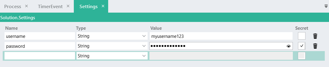
Add a Setting
- Click Settings on the toolbar
- On the main canvas a Settings tab is created. Enter the details of the Settings by entering the setting's Name, select the Type (e.g. String, Integer, List, etc), and add an optional Value.
- Select the Secret checkbox to mask the value, if required.
Secret settings
When a Setting is marked as "secret" it ensures that any personal or sensitive data stored in that Setting will remain secure, e.g passwords, usernames, ID numbers, etc.
Important:
When a Setting is marked as "secret", Linx will not export the value of the setting from the Designer to the Server when the Solution is deployed. On the Server the Setting value will be blank.
For "secret" Settings, you must provide a value for the Setting on the Server before starting your Solution.
Using a Setting's value inside another Setting
To reference an existing Setting's value inside another Setting's value, add the existing value inside curly brackets to the new setting's value, e.g. {var1}xyz, as shown below:
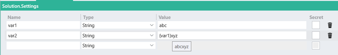
In the above example, var2 resolves to a value of "abcxyz". Hover your cursor over the setting to view the resolved value in the displayed tooltip.
Using a Setting
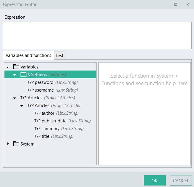
Settings are available for use when setting up Properties and Expressions.
Properties
Expression Editor
Note:
When a Solution is deployed to Linx Application Server, the settings are available to be edited from within Linx Application Server. In this case there is no need to edit the settings within Linx Application Designer and to redeploy the Solution to Linx Application Server.
Types
Types enable you to create your own type in Linx by defining its structure. These are typically complex types, types that consist of a variety of other types and sub-types.
Add a Type
- Click Type on the toolbar
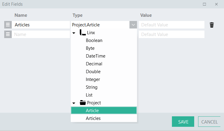
- In the Properties section, open the Properties Editor [...] to add the fields for the Type.
- For each field, enter the field's Name, select the Type (e.g. String, Integer, List, etc), and add an optional Value.
- Click the Save button
Import a Type
- Click Project on the menu bar
- Click on Import Type
- In the Import Editor, either browse for a file or paste JSON, JSON schema, XML or XML schema data.
- Click the Create button
Examples
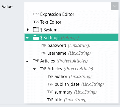
A simple Type
An example of a simple Type is the one shown in the screenshot below, called 'Article'. It consists of various String-type fields (author, publish_date, summary, and title).
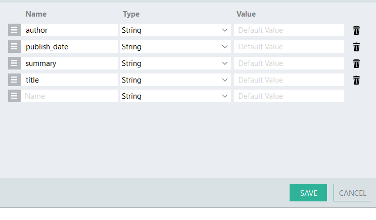
A complex Type
An example of a complex Type is shown below, called 'Article_List'. This Type consists of one field ('Articles'), but this field is referencing another Type (called 'Article', which is the one from the example above for a simple Type) that contains a set of fields. The fields that are contained in the Type that is being referenced ('Article'), now also becomes part of the complex Type ('Article_List').
More examples
A Type might be a 'Customer'. Such a customer would probably have properties like Name, Address and a list of purchases. When you create this type, you will want to specify that the type has a string field called 'Name', another string field with an address and a list of purchases. A purchase is also a type and you will need to create it first. It may consist of a purchase date, an amount and a product. So, you will also need to create a purchase type with a date type called 'purchase date', a decimal called 'purchase amount' and a string called 'Product Name'. You have now created a complex type for storing a customer and all related purchases.
When you point this type at a database query result that has the same fields, you can get Linx to automatically populate the complex type directly from your SQL query.
Definition
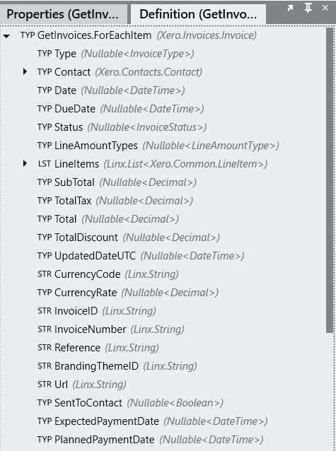
When a specific function is selected, those variables for which output results could be retrieved by the function are displayed in the Definition section.